Here is a collection of some of my favourite projects while attending VCAD.
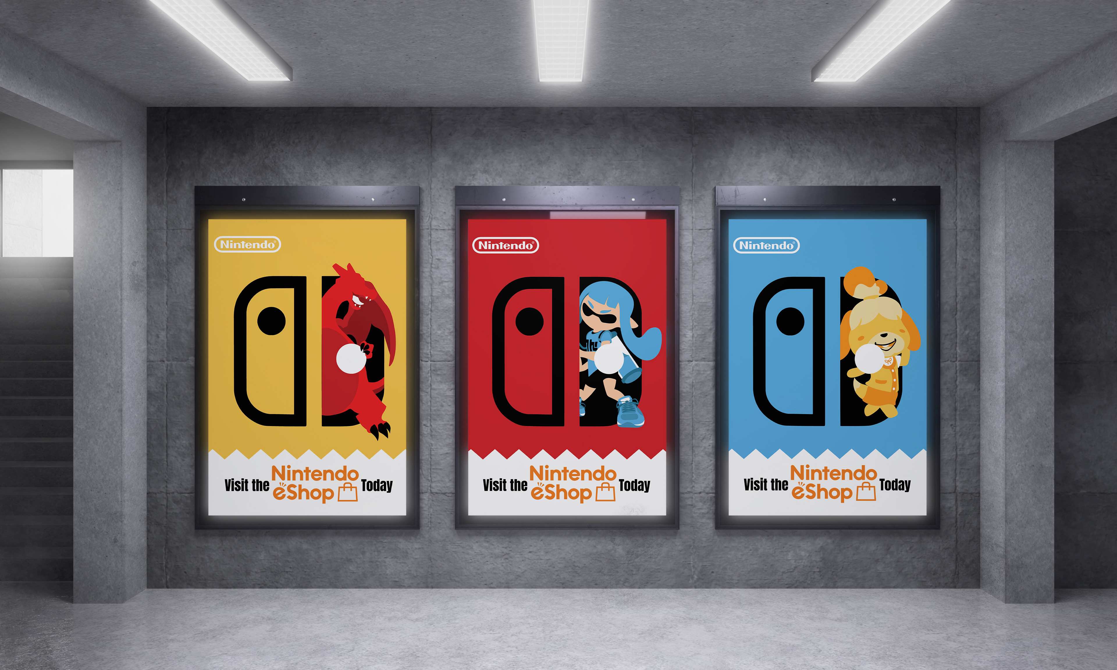
This ad campaign consists of three Nintendo Switch print posters. The campaign itself is centered around three of Nintendo’s noteworthy mascots, the characters were selected from popular Nintendo Switch games that have been known to be fan favourites in their respective games.


The main purpose of the set of three Canon ads is to promote online shopping from their site directly. Each ad has a different tagline referring to both the camera as well as a way of life. Each ad uses the contrast of black and white with a splash of colour to draw attention and create a clear focal point, by doing this it also helps the bright red Canon logo stand out.


Shea Moisture is an everyday luxury brand but the original design did not reflect the quality of the product. This rebrand was done to bring their image more in line with their products.


Pandora's goal is to become the most well-known jewelry brand in the world to do this a new logo was designed. The new logo was designed to be more elegant and refined to try and compete with other high-end brands. New packaging designs were created as well as a small variety of advertisements.
The typeface was changed to appear more elegant and refined with the O being turned into a diamond ring to reflect their desire to beautify the world through jewelry.
The typeface was changed to appear more elegant and refined with the O being turned into a diamond ring to reflect their desire to beautify the world through jewelry.


This was a project where I was tasked with rebranding a local business. The Barley Station needed an updated logo. The original logo was very busy and needed to be modernized. This rebrand would also include updated menus as well as some packaging designs.
The logo was redesigned with the goal of being familiar but new, keeping the hops and barley from the original while making it appear more lively.


